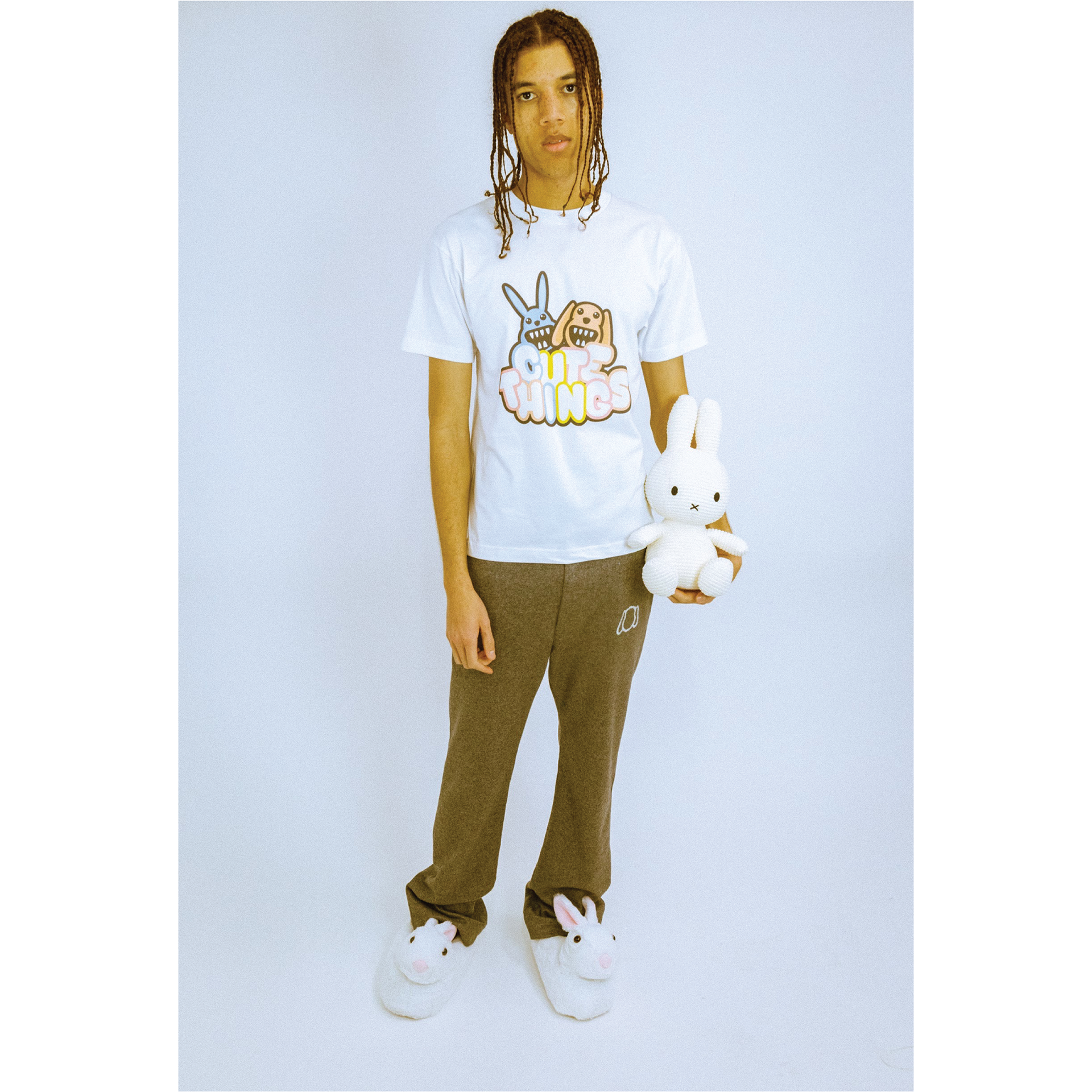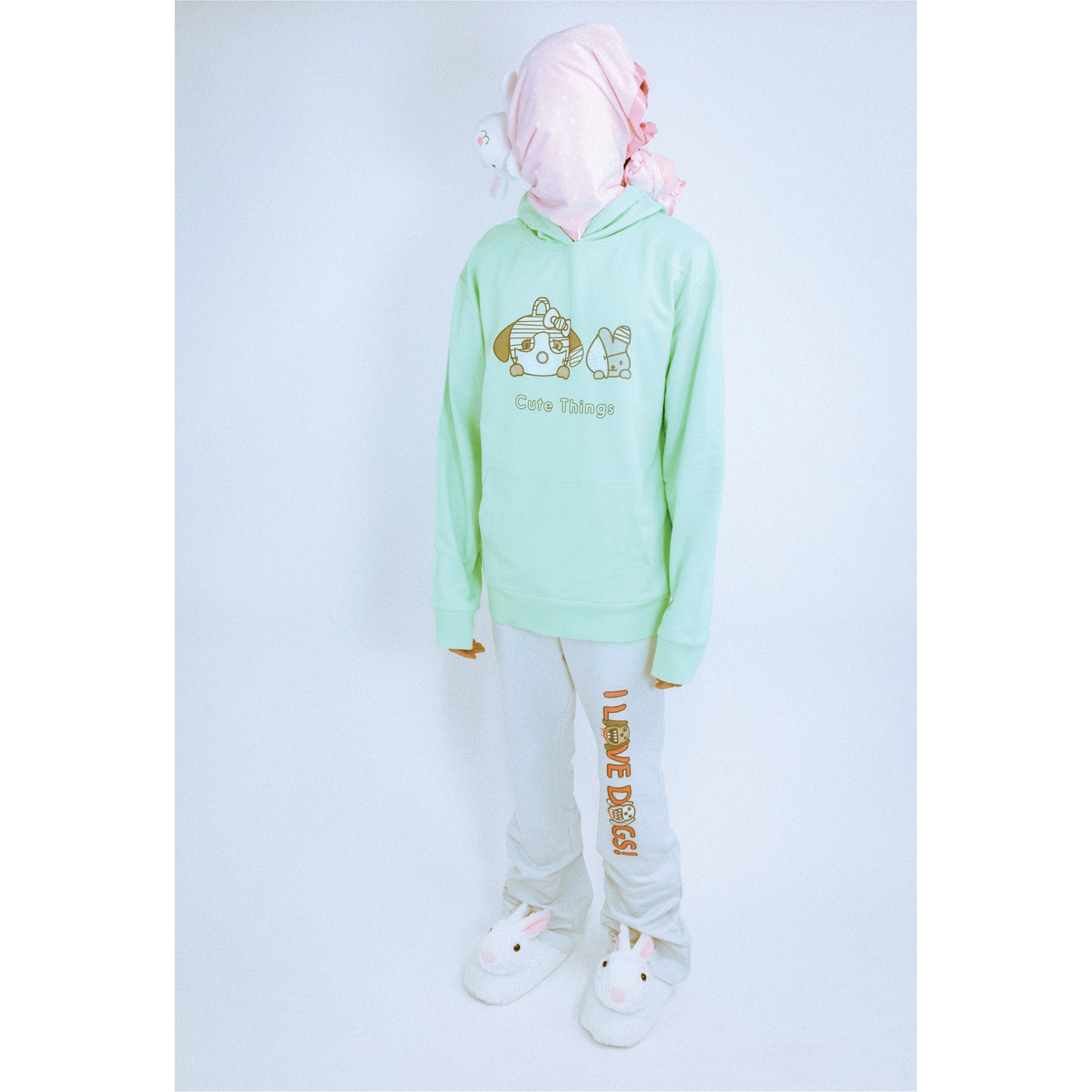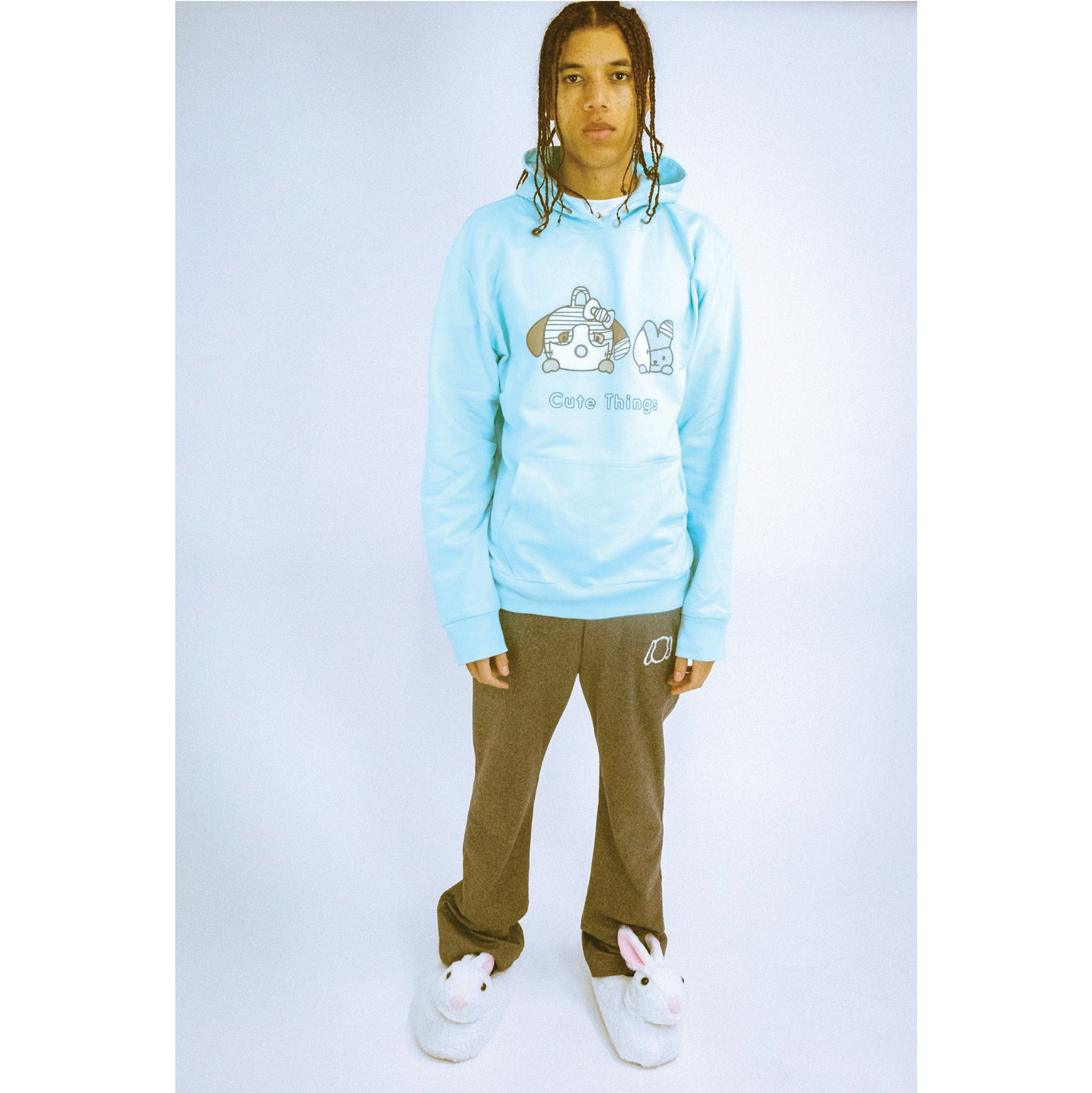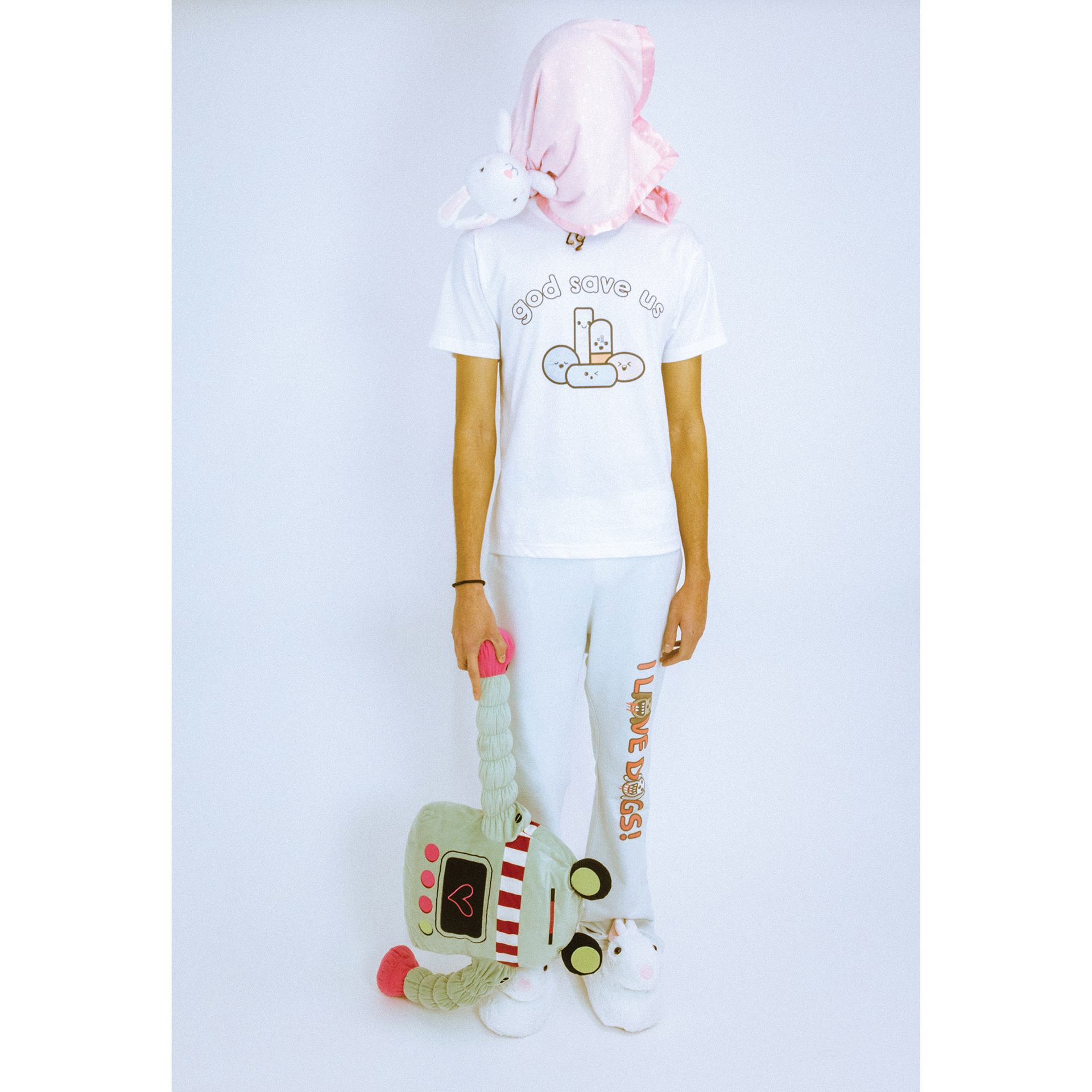
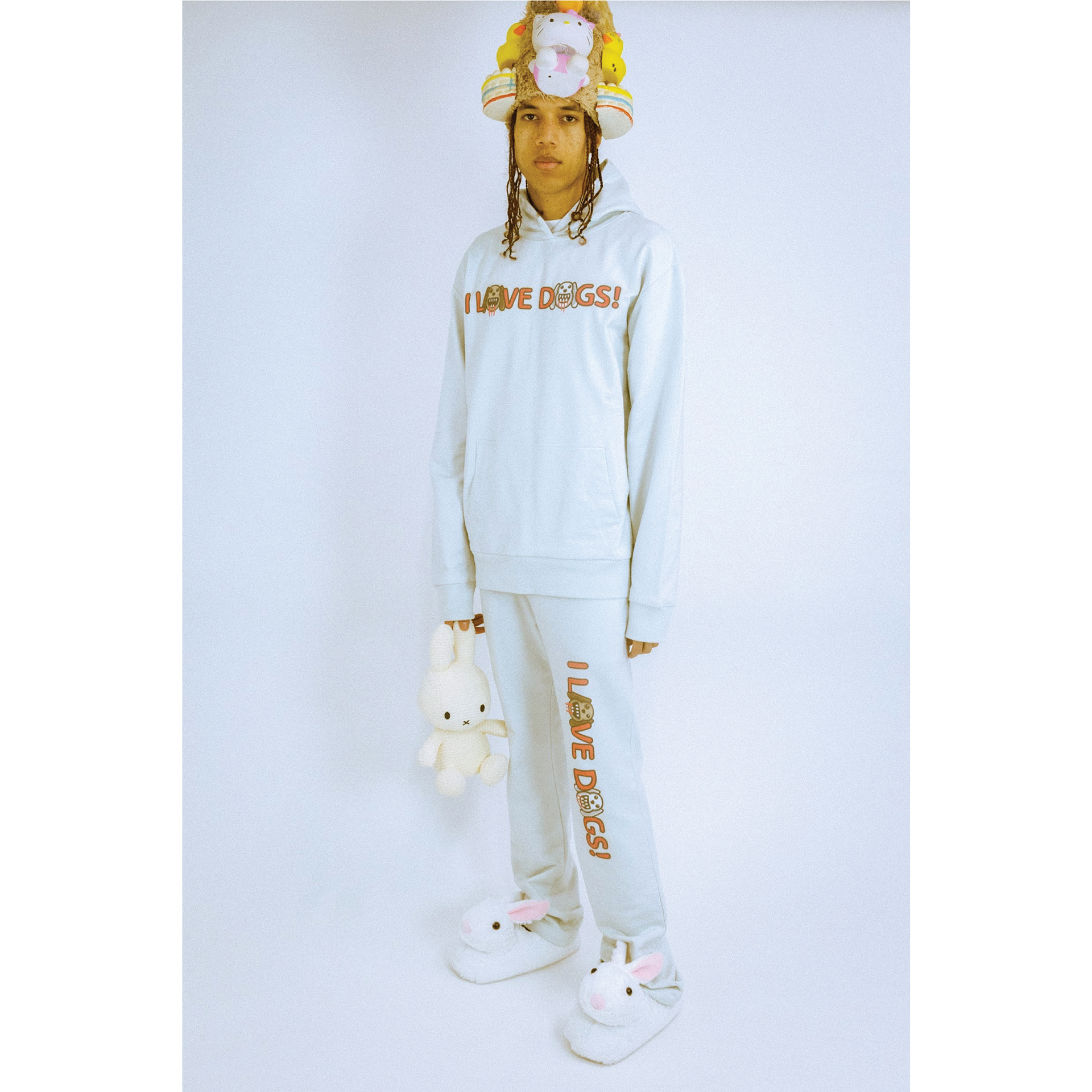


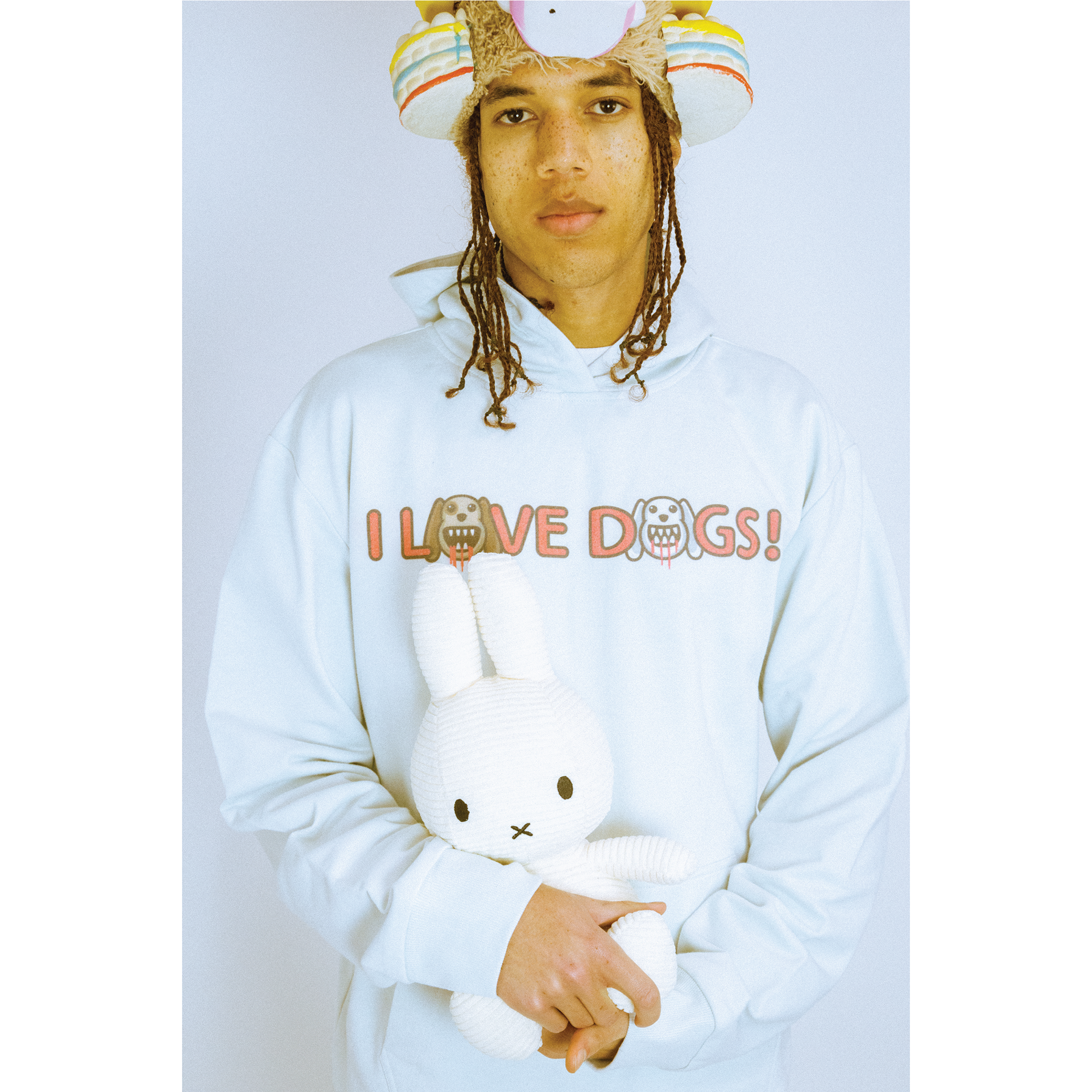

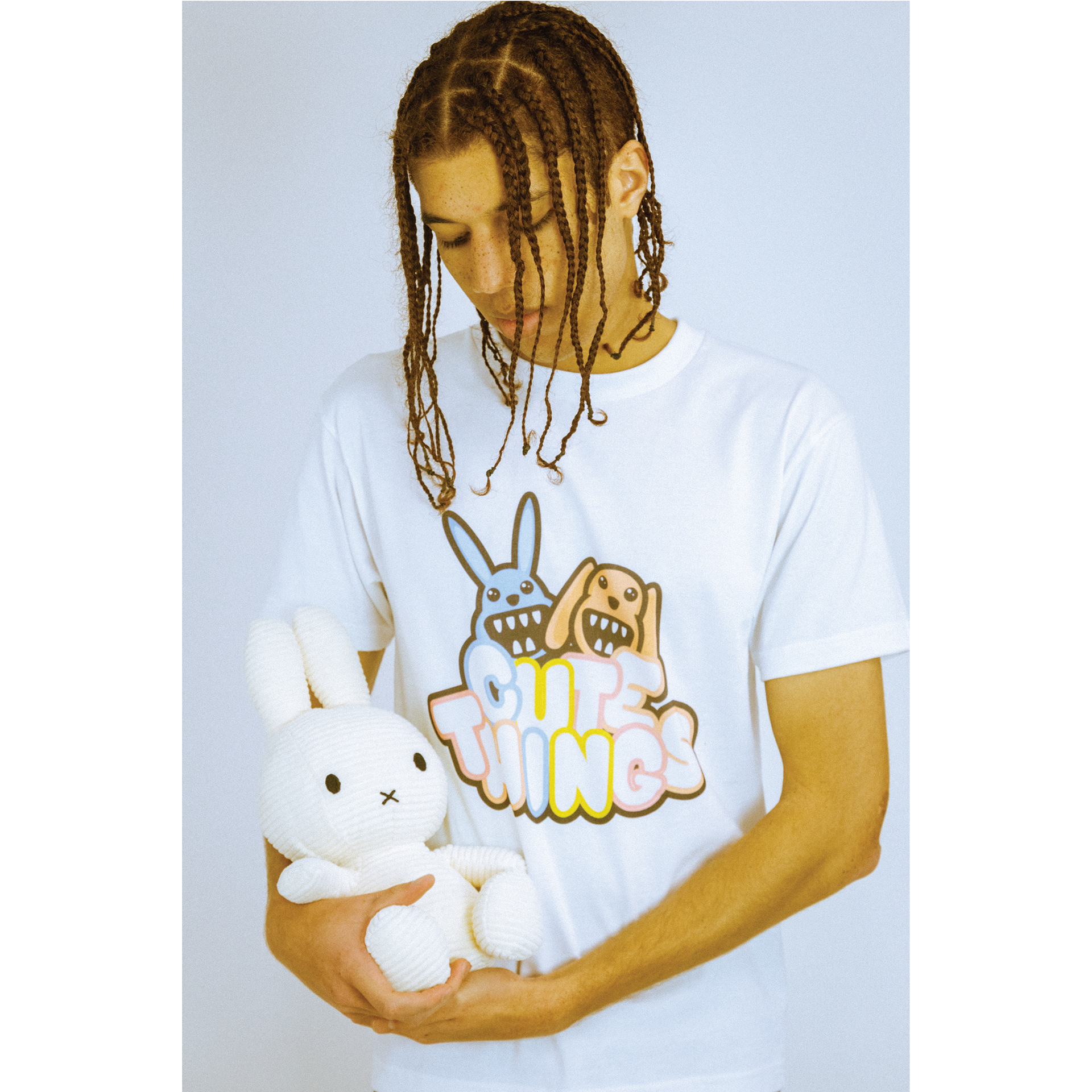
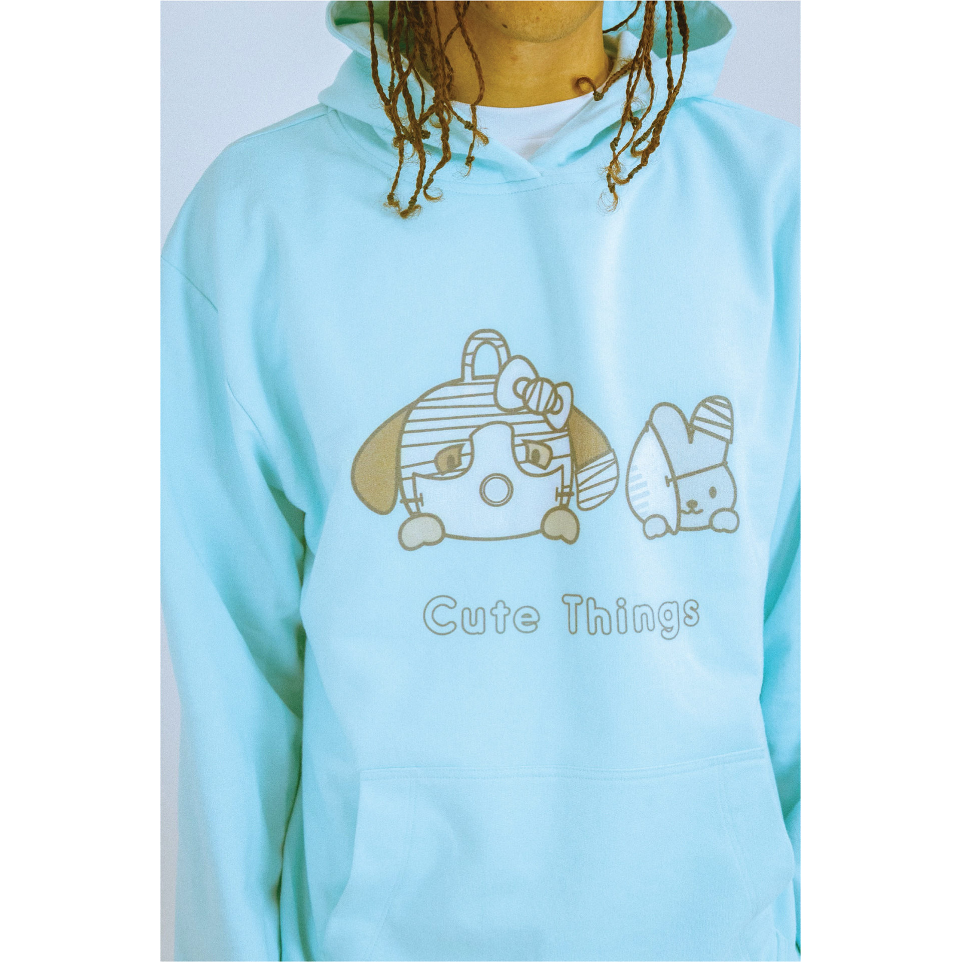
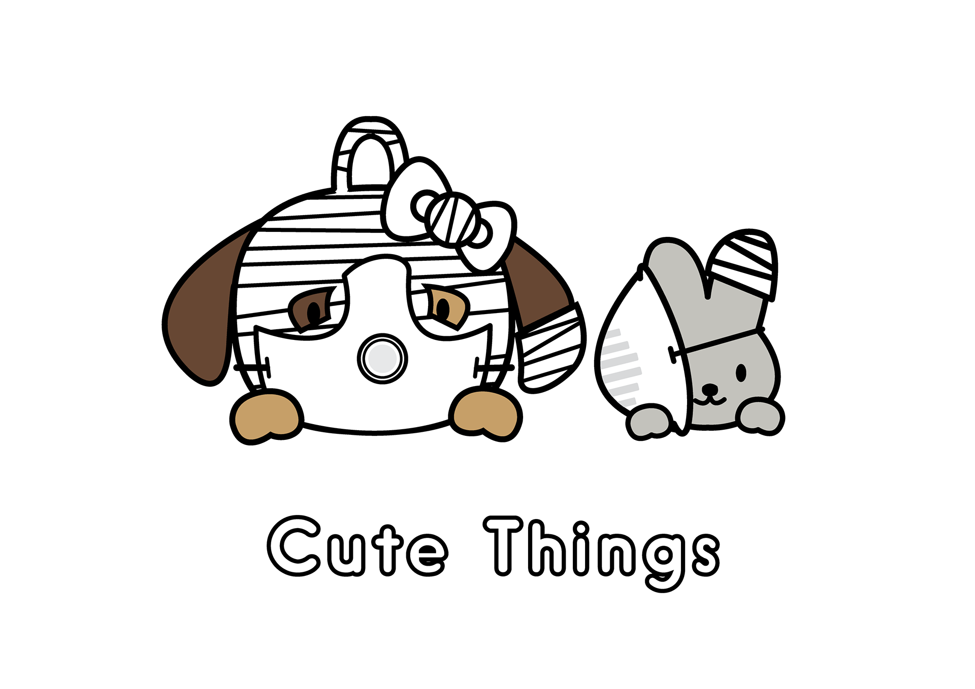
Pictured is the lookbook for the first season of a streetwear/leisurewear brand founded by myself and three friends during the summer of 2019, called We Have Cute Things. Within the brand I serve as creative director and graphic designer, and for this project also worked as the primary stylist for the lookbook.
We Have Cute Things has a focus on graphics which borrow from Japanese visual culture's "kawaii" style, or cute style, as well as the general notion of the kitsch. Embedded within these cute and approachable graphics are details referencing dark or complex themes, disrupting the outward appearance of innocence and childhood these graphics otherwise bear. The graphics and overall tone of this first season was also heavily inspired by my 2019 project Post-Consumption, which focused on the re-contextualization of consumer items, with a particular focus on toys and novelties.
The goal of this project was three things:
First, I looked to translate the tone and mood of my Post-Consumption project into a slightly more accessible format, intended to be wearable during everyday occasions, yet still enriched with a subtext when examined closely.
Second, I wanted to experiment with graphic design and the sensation of "flatness" and soft color, rather than "objectness" and highly visual texture, as was more of a focus during the original Post-Consumption project.
Third, this first collection for We Have Cute Things was intended to establish a baseline for the brand, in order to communicate its fundamental ethos and create a visual language that could be expanded upon as the brand develops.
Model: @notjaron
Photographer: @foodeatschrist
Special thank you to Blynda Chen, Jack Carbeck and Shaun Sosa for their work on the collection
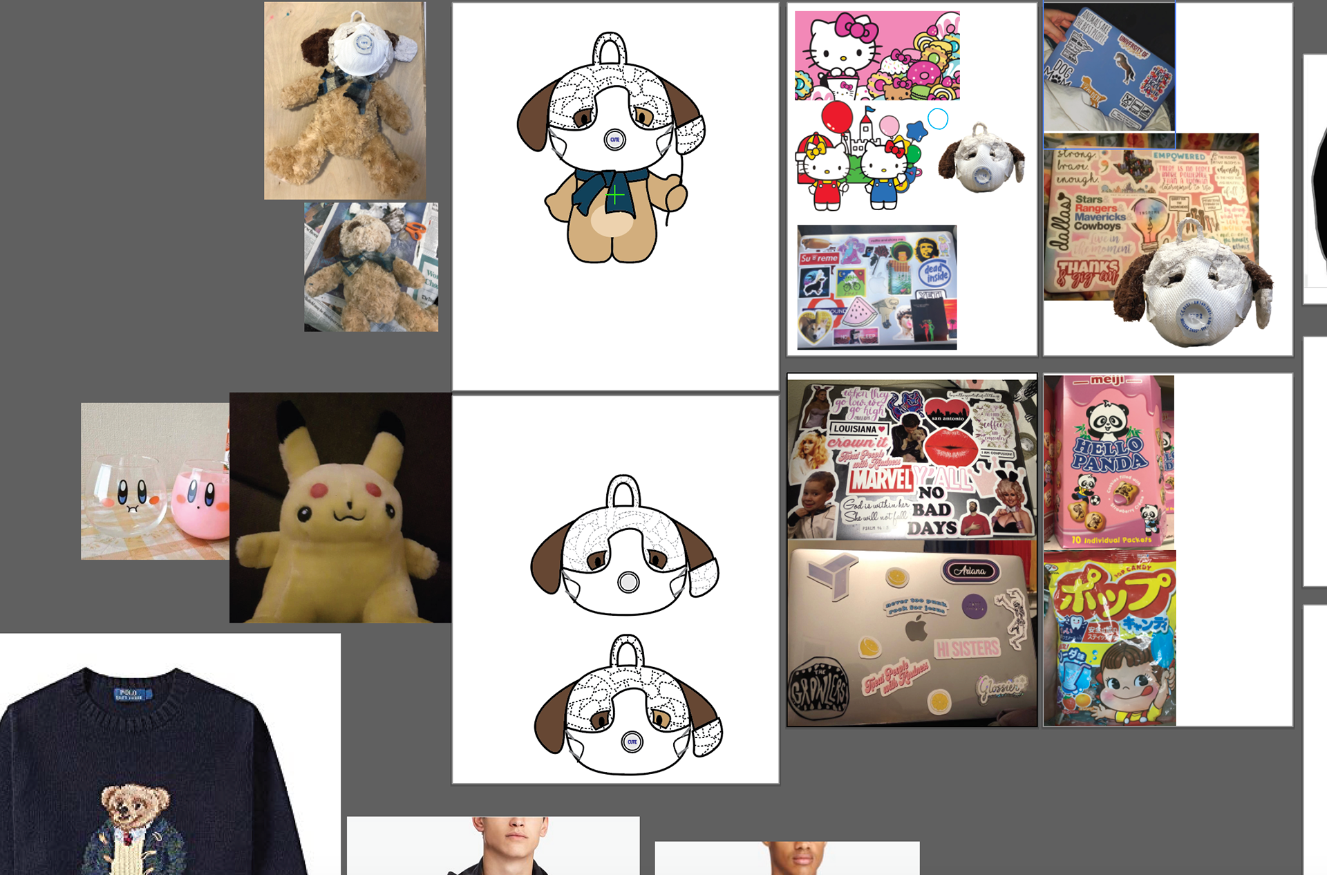
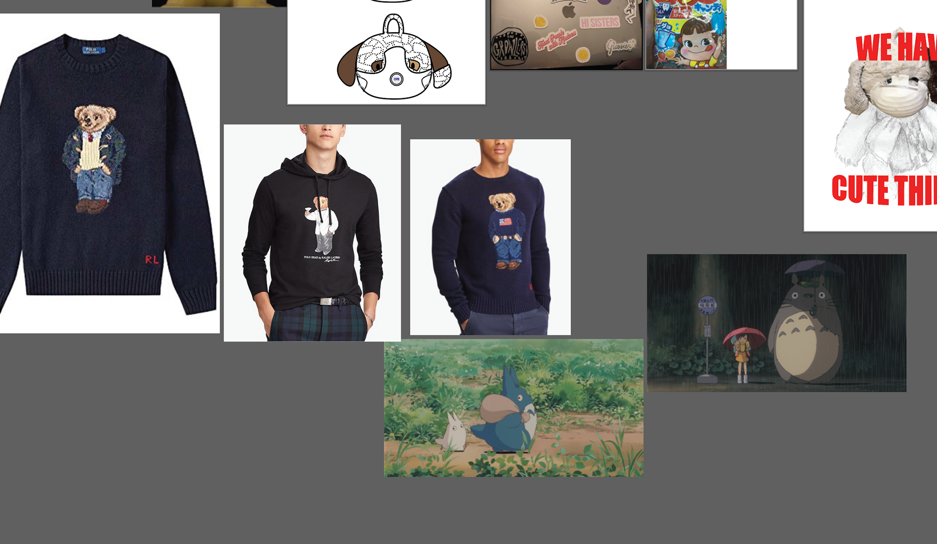
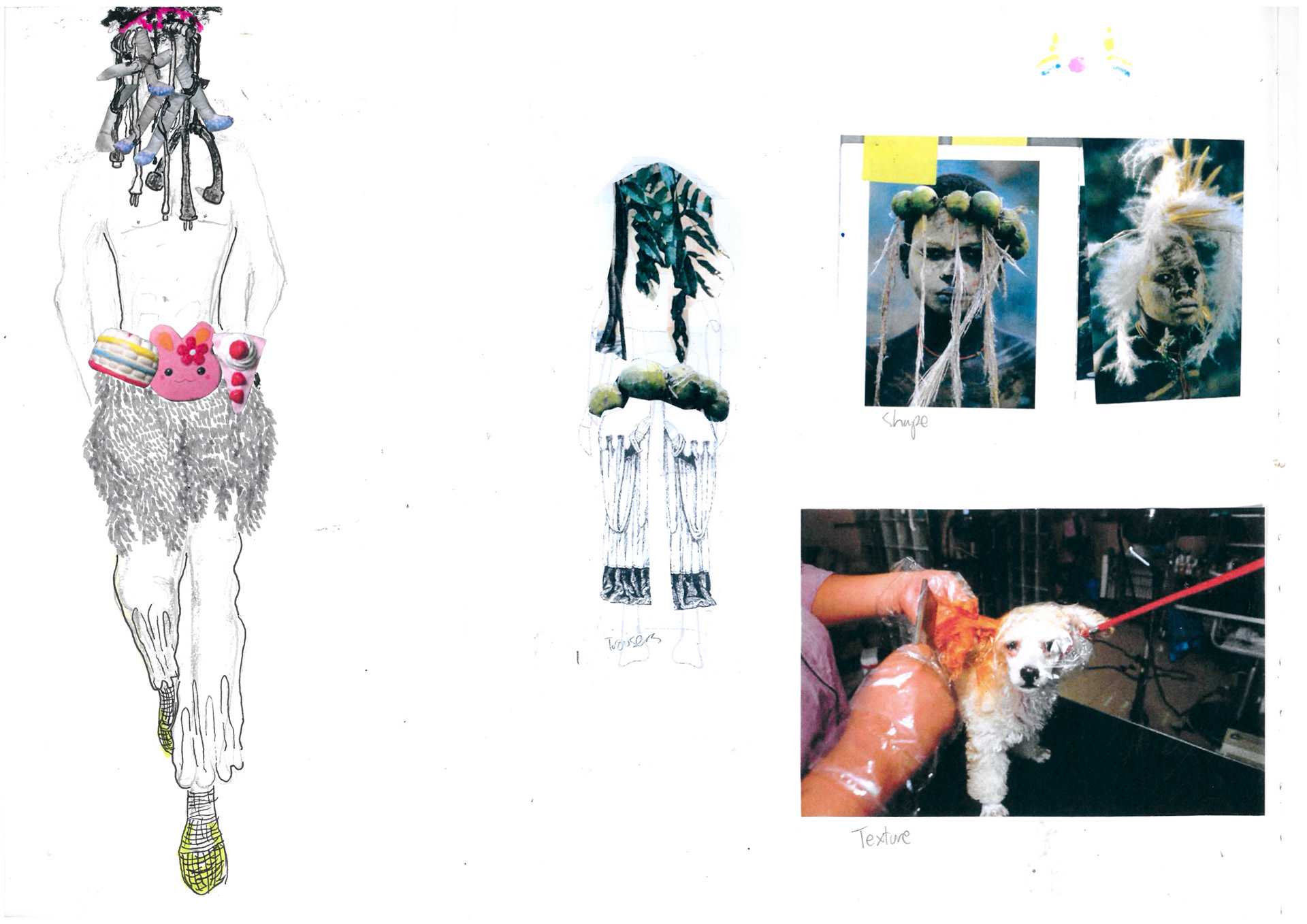
Visual Research

Focusing on kawaii and the kitsch

Includes images from an early project of mine
Attempted a "digital sketchbook" in Adobe Illustrator as a sort of experiment for myself, but in retrospect perhaps a traditional paper sketchbook would have made the process a bit more organized
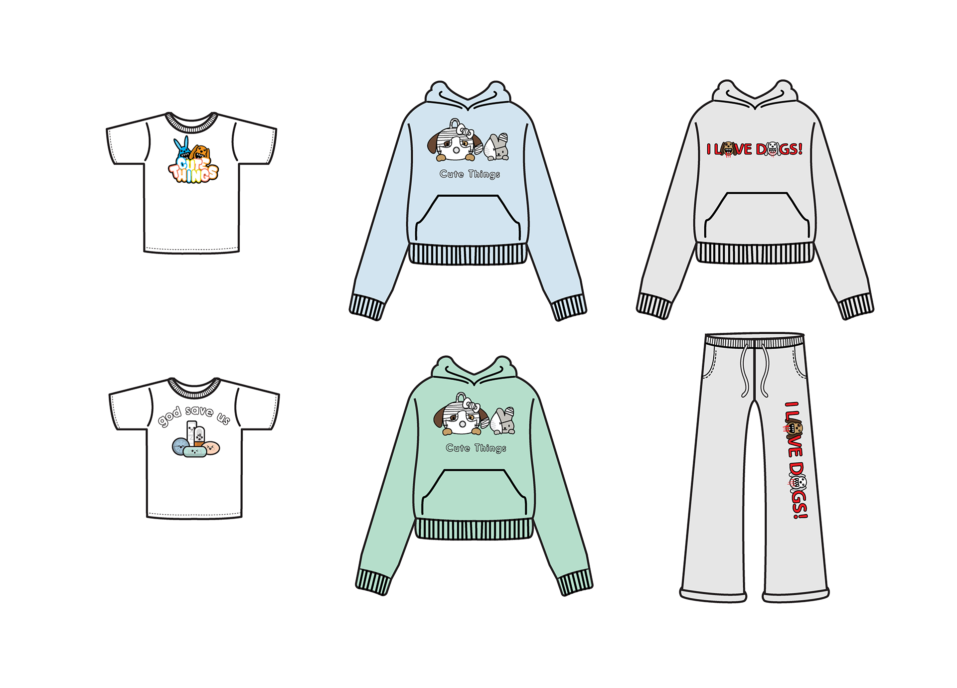
Graphics
Development and process
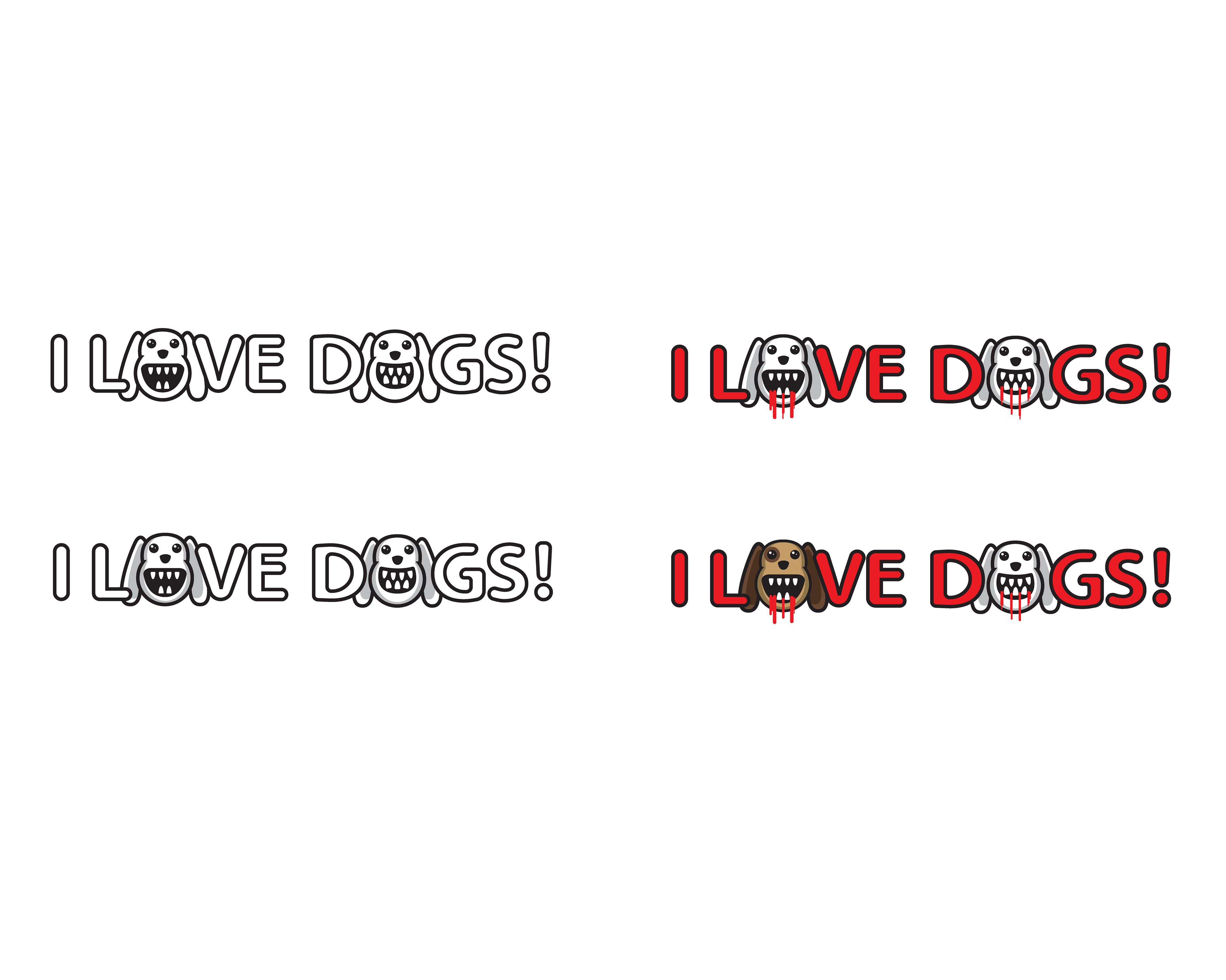


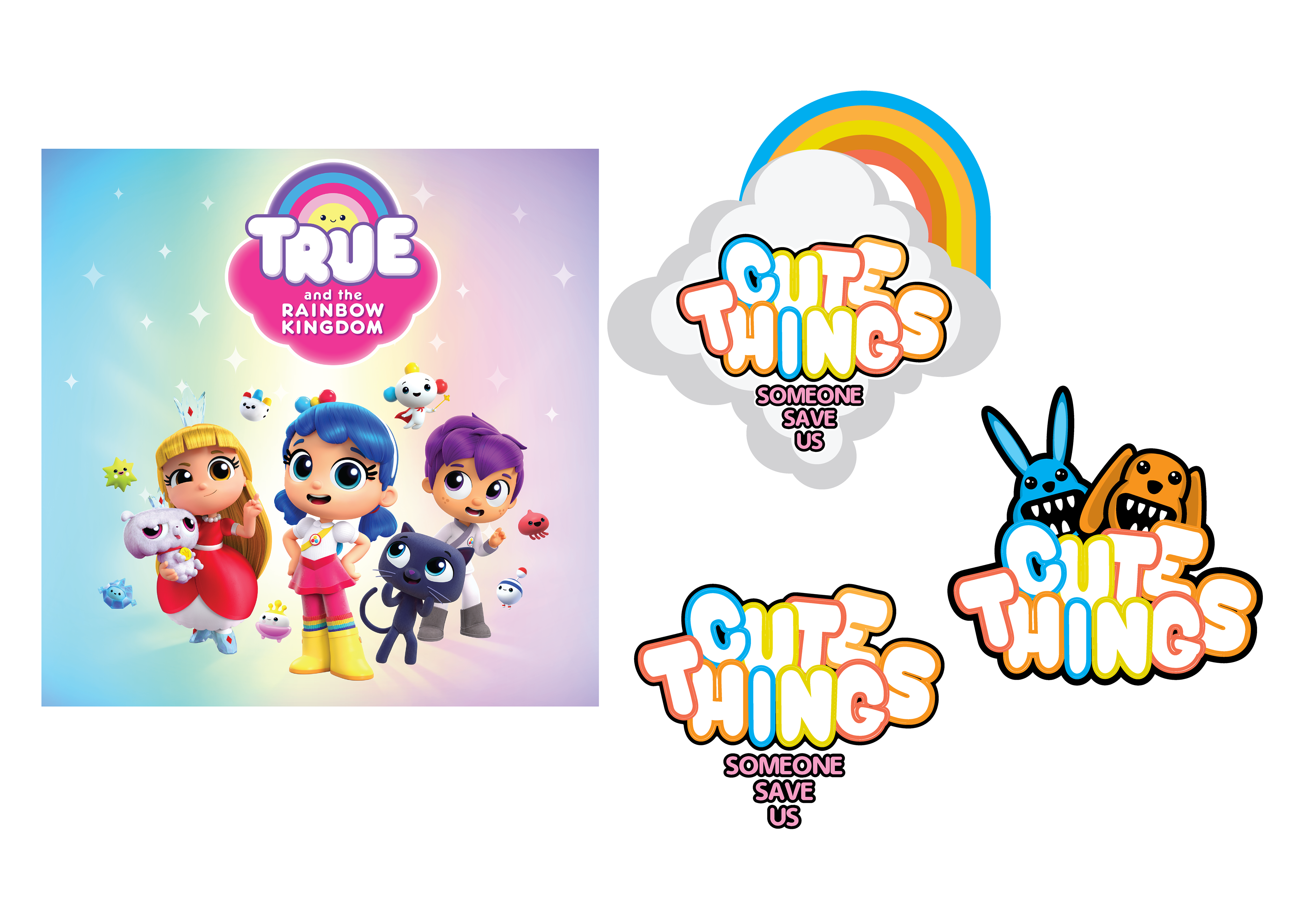
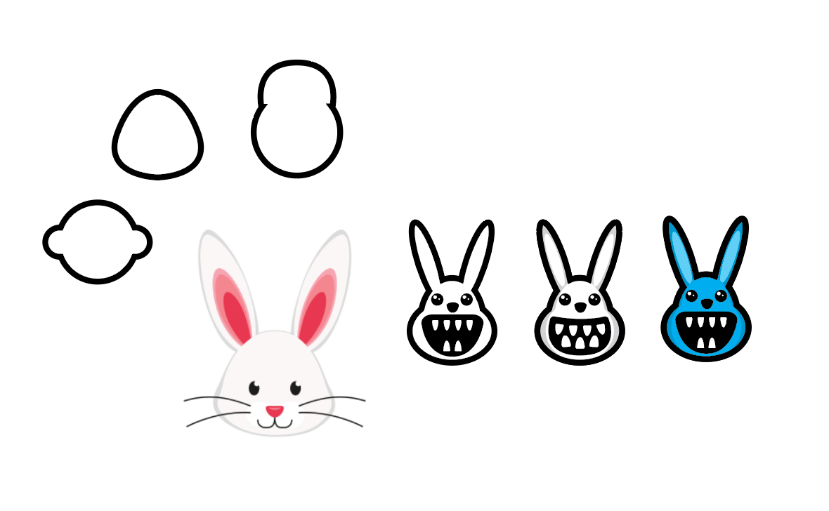

Final graphics
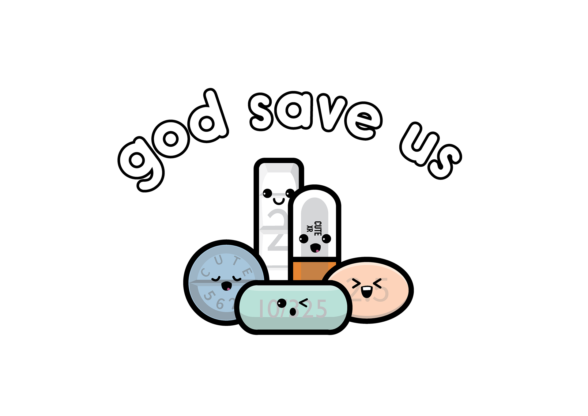


Garment Tech Flats and Color Palette
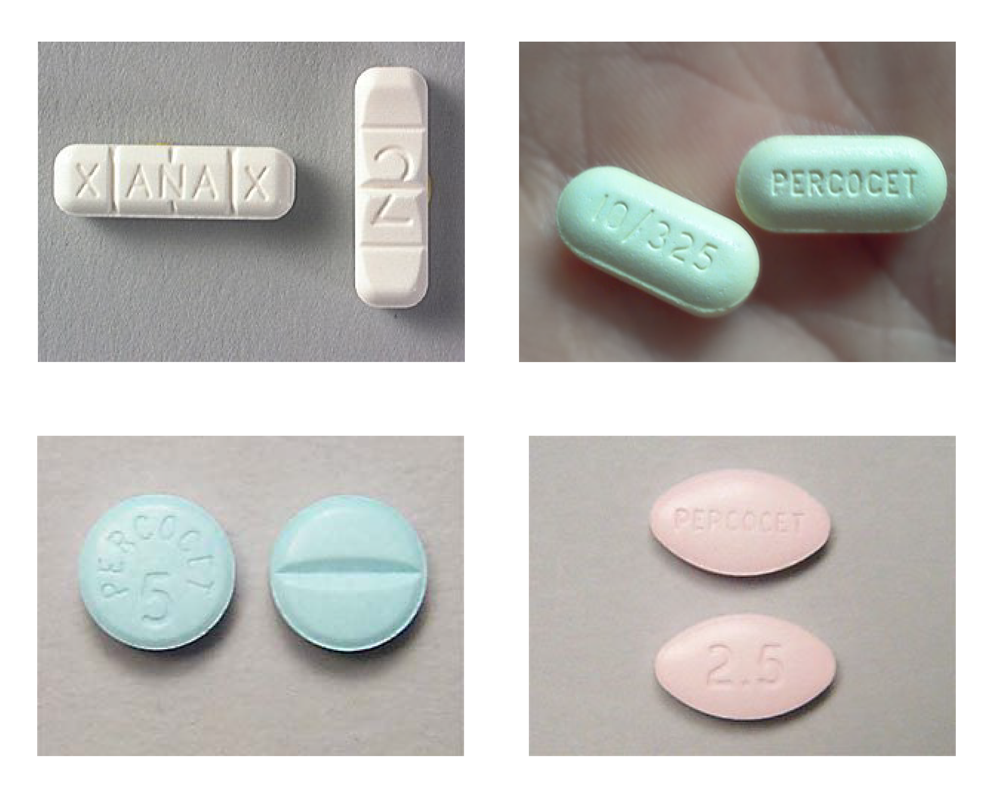
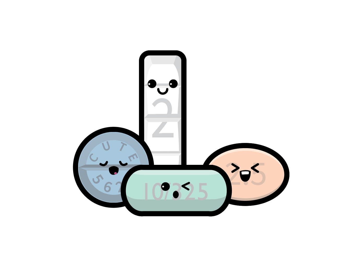
The soft colors of prescription opioid and benzodiazepine pills
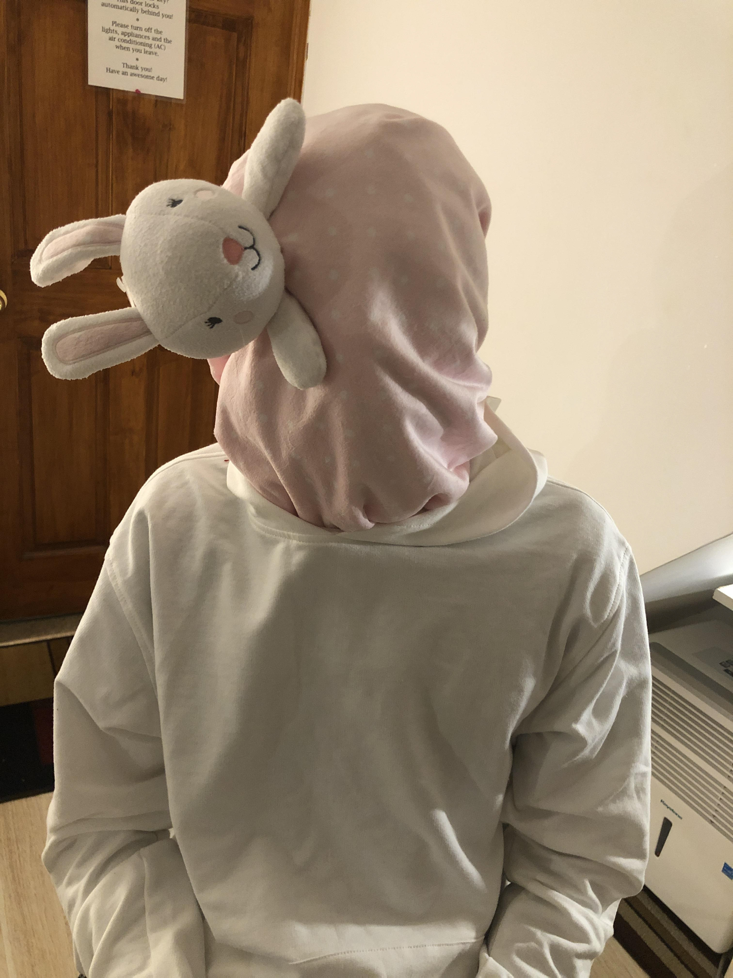
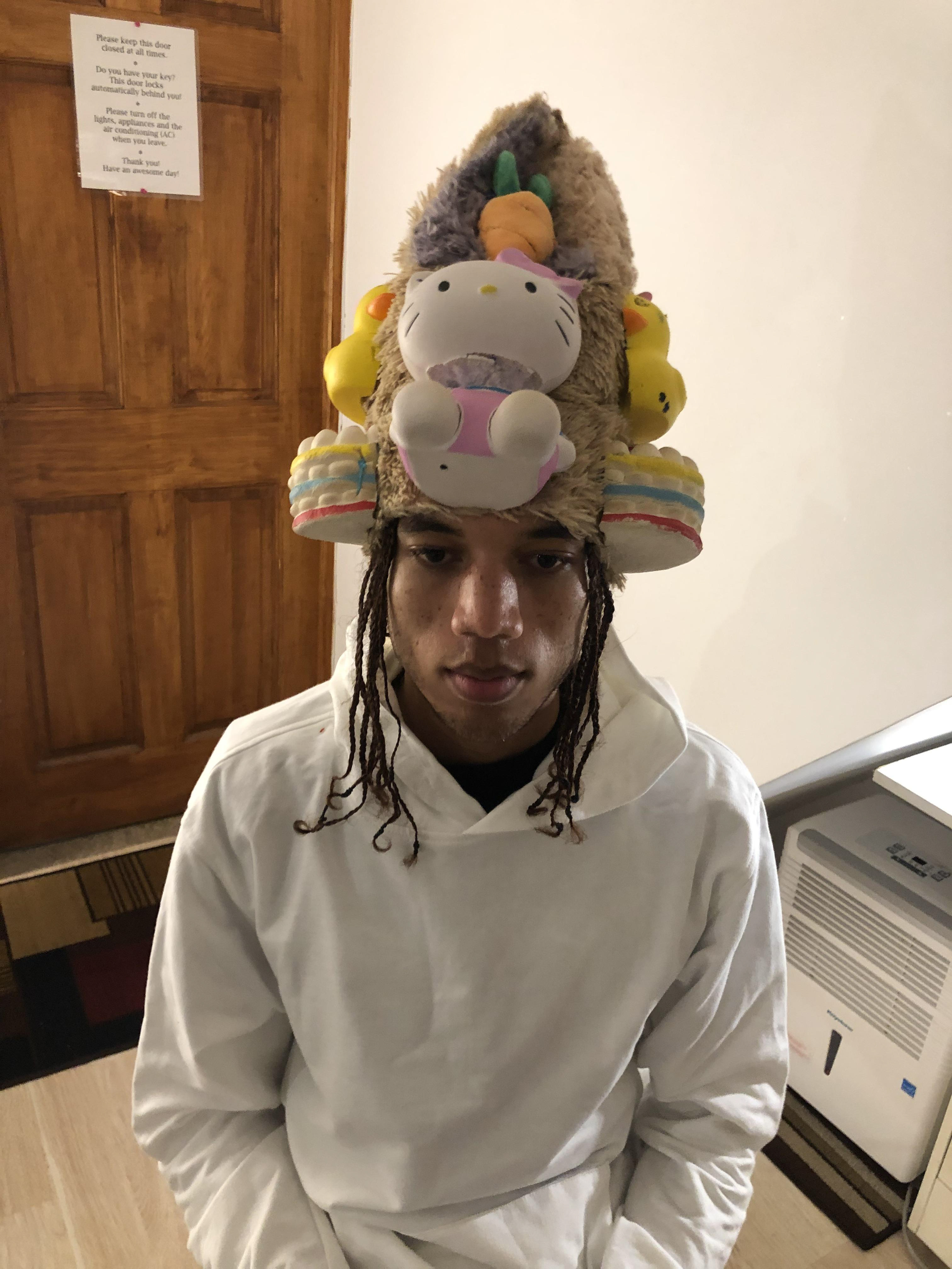
Lookbook Shoot
Early sketches
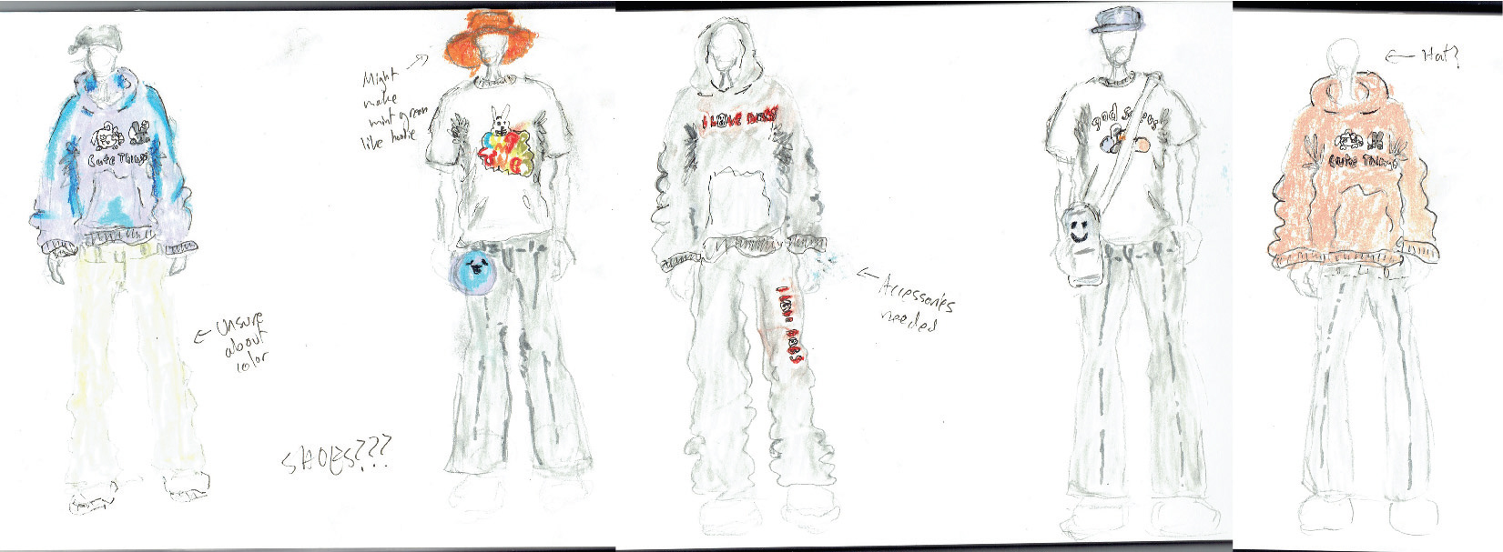
Pre-shoot experimentation, with references to looks in my Post-Consumption project
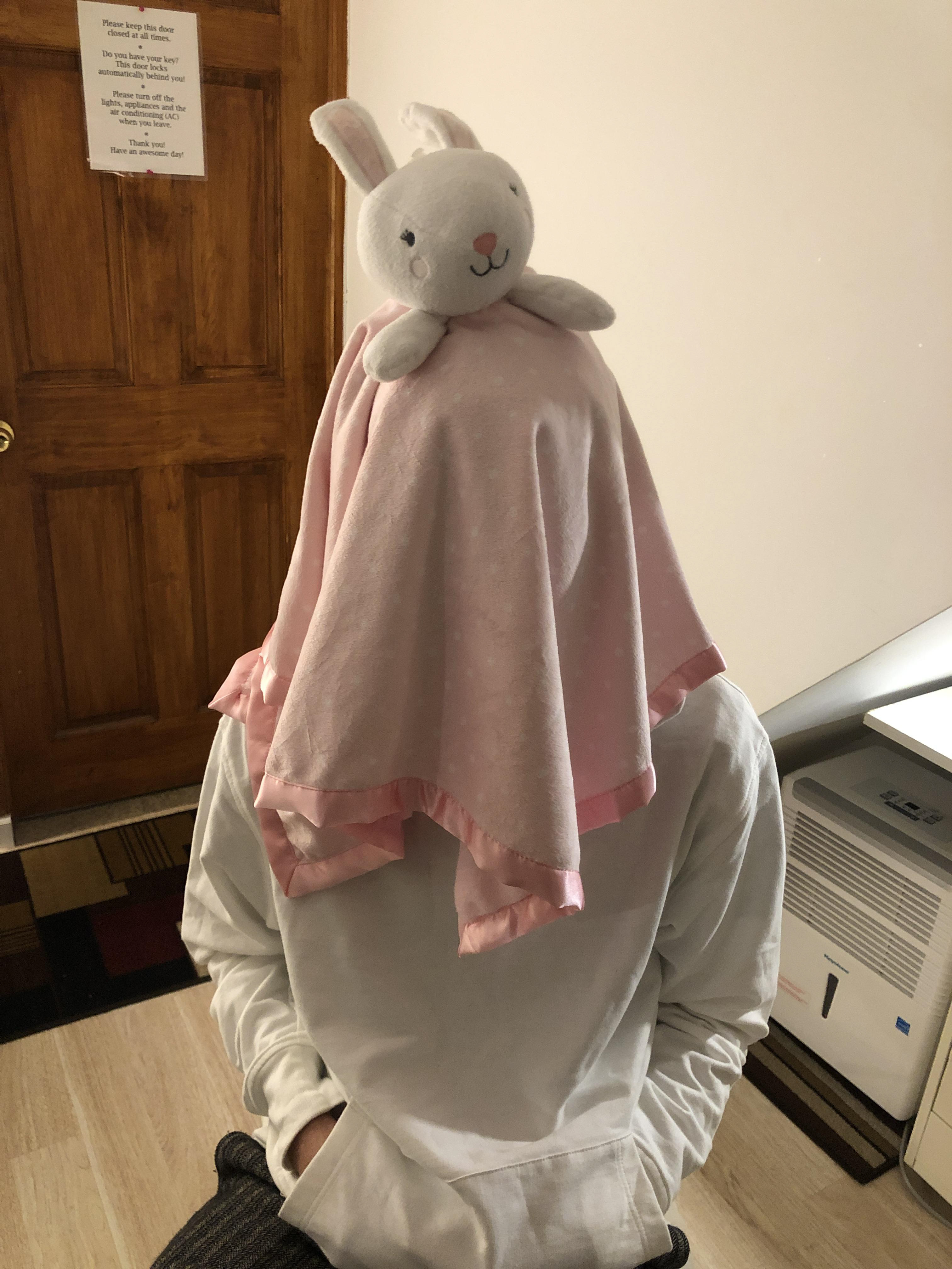


Photoshoot

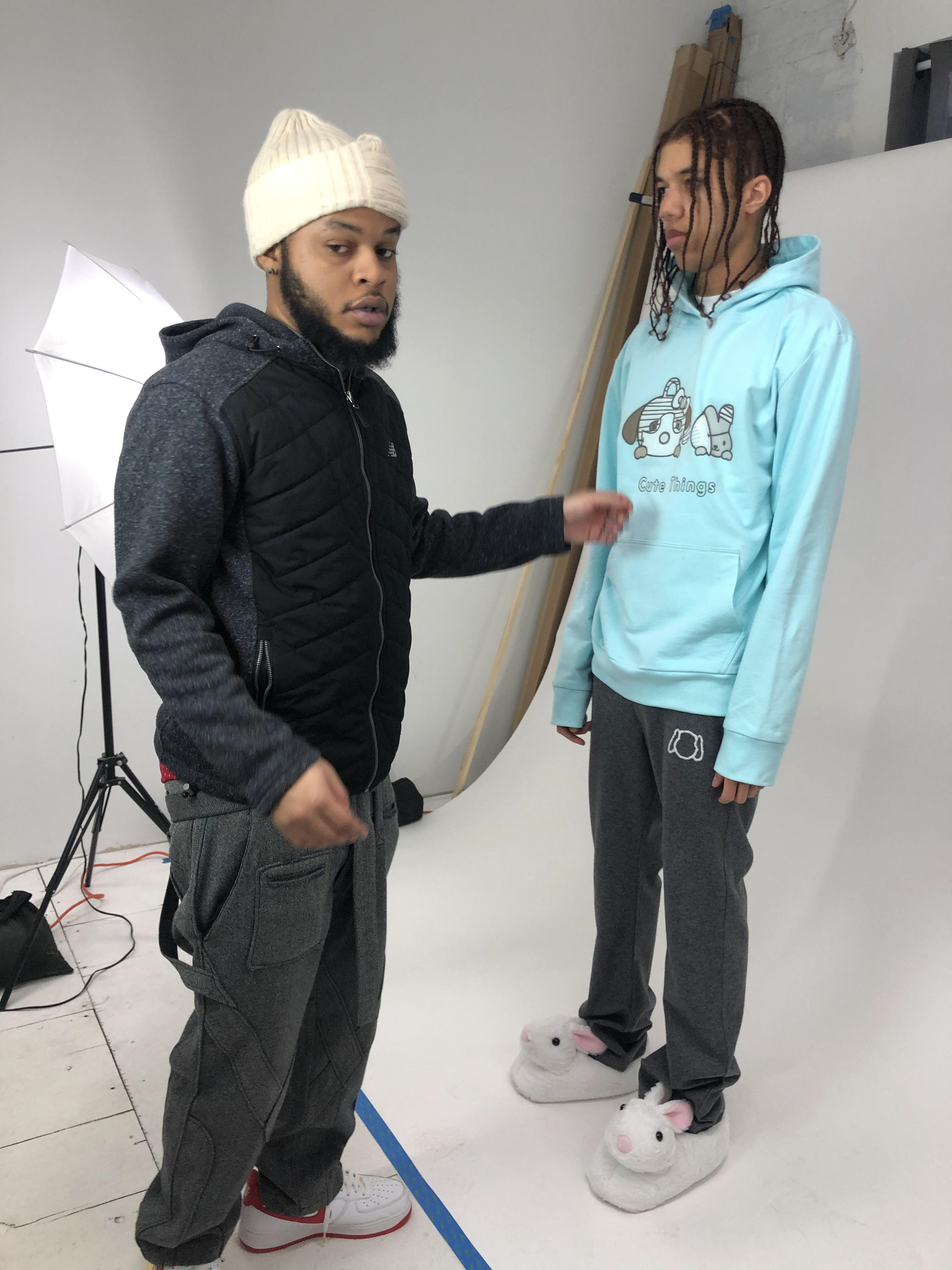
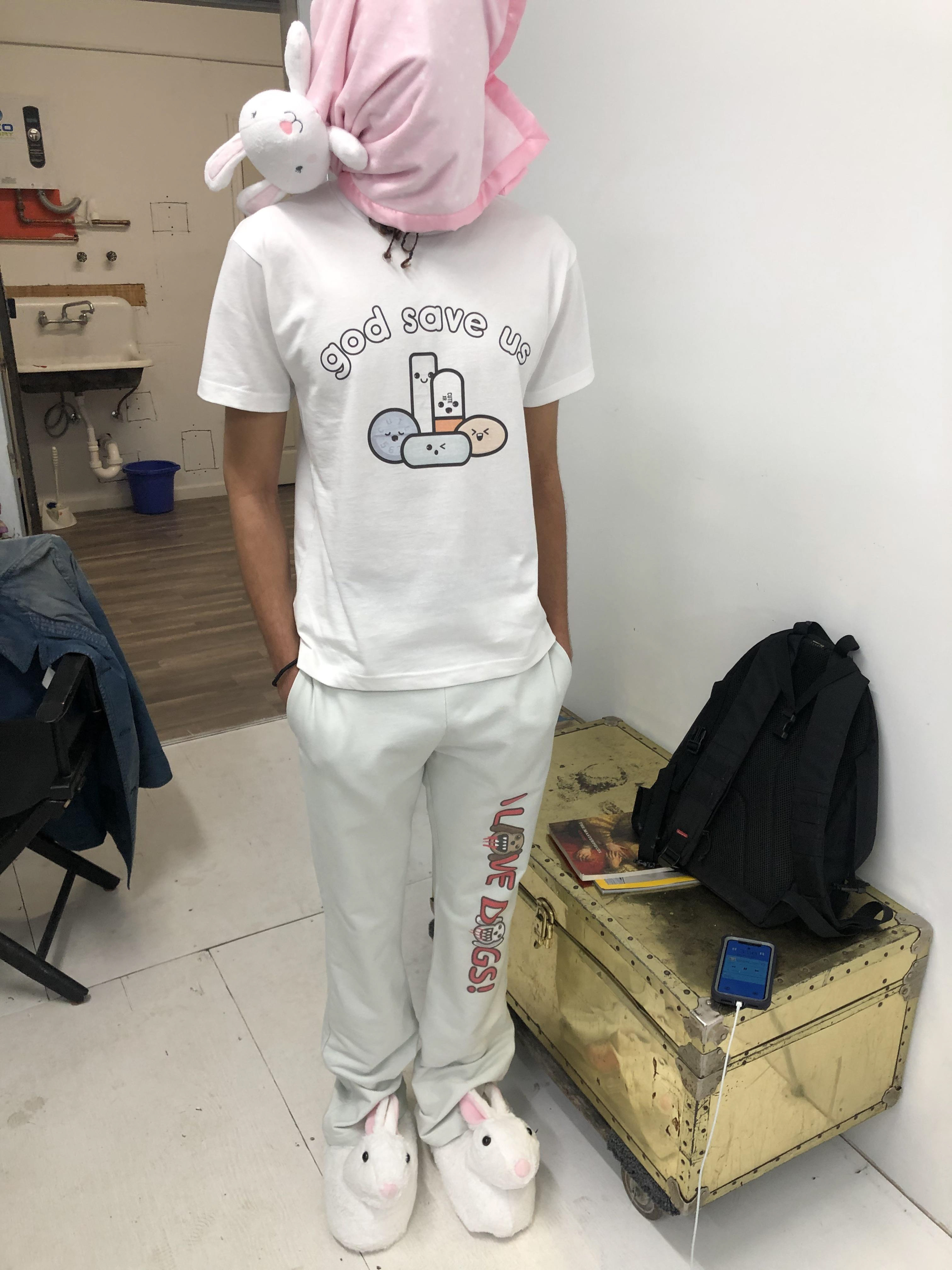
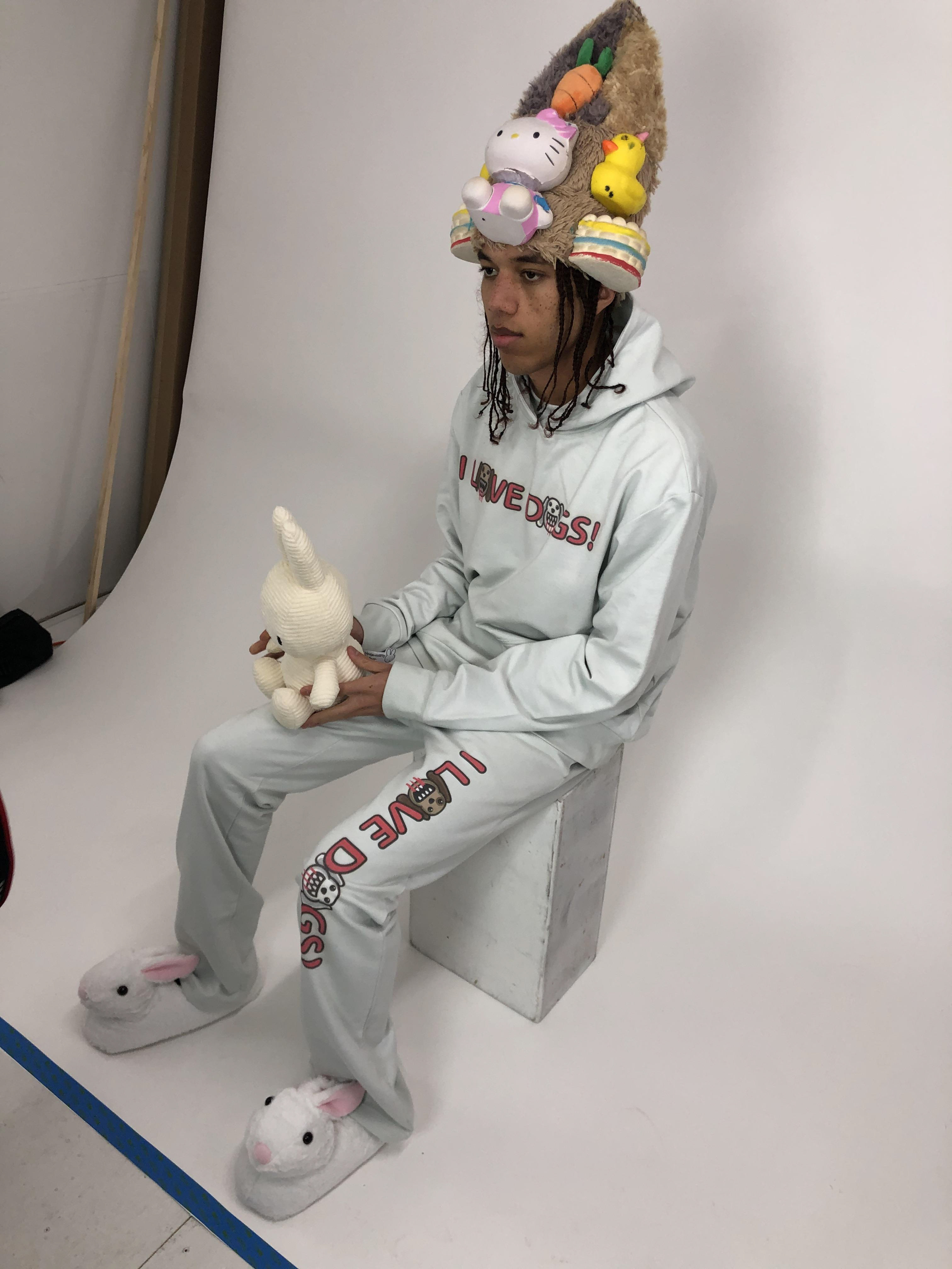
Looks